Feel free to click on the source to see how the code works or you can also simply scroll through to see the plots if you are in a rush!!!
Let’s start by importing our libraries!
Source
import pandas as pd
import seaborn as sns
import matplotlib.pyplot as plt
Now we load the tsv data for our pyscene data. We’ll also add an episode and seasons column!
Source
df= pd.read_csv("../output/scenes_data.tsv", sep='\t')Source
df["season"] = df["episode"].str.extract(r's(\d+)', expand=False).astype(int)
df["episode_short"] = df["episode"].str.extract(r'(s\d+e\d+)', expand=False).str.upper()
mean_duration = df.groupby("episode_short", as_index=False)["duration"].mean()
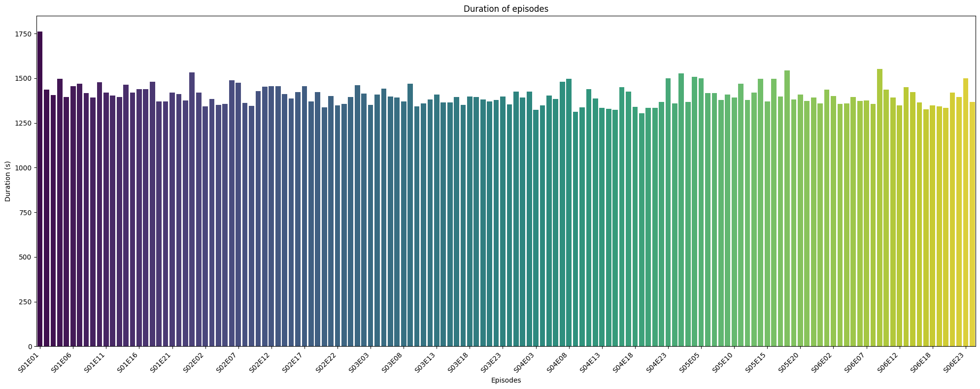
DURATION OF EPISODES 🕰️
Source
episode_durations = df.groupby("episode_short")["duration"].sum().reset_index(name="episode_duration")Despite some possible outliers, we see that the episode all have about the same runtime.
Source
plt.figure(figsize=(20, 8))
ax = sns.barplot(data=episode_durations, x="episode_short", y="episode_duration", palette="viridis")
ax.set_xticks(ax.get_xticks()[::5])  # show every 5th label
ax.set_xticklabels(ax.get_xticklabels(), rotation=45, ha="right")
plt.title("Duration of episodes")
plt.ylabel("Duration (s)")
plt.xlabel("Episodes")
plt.tight_layout()
plt.show()
/tmp/ipykernel_6421/1315073239.py:2: FutureWarning:

Passing `palette` without assigning `hue` is deprecated and will be removed in v0.14.0. Assign the `x` variable to `hue` and set `legend=False` for the same effect.

  ax = sns.barplot(data=episode_durations, x="episode_short", y="episode_duration", palette="viridis")
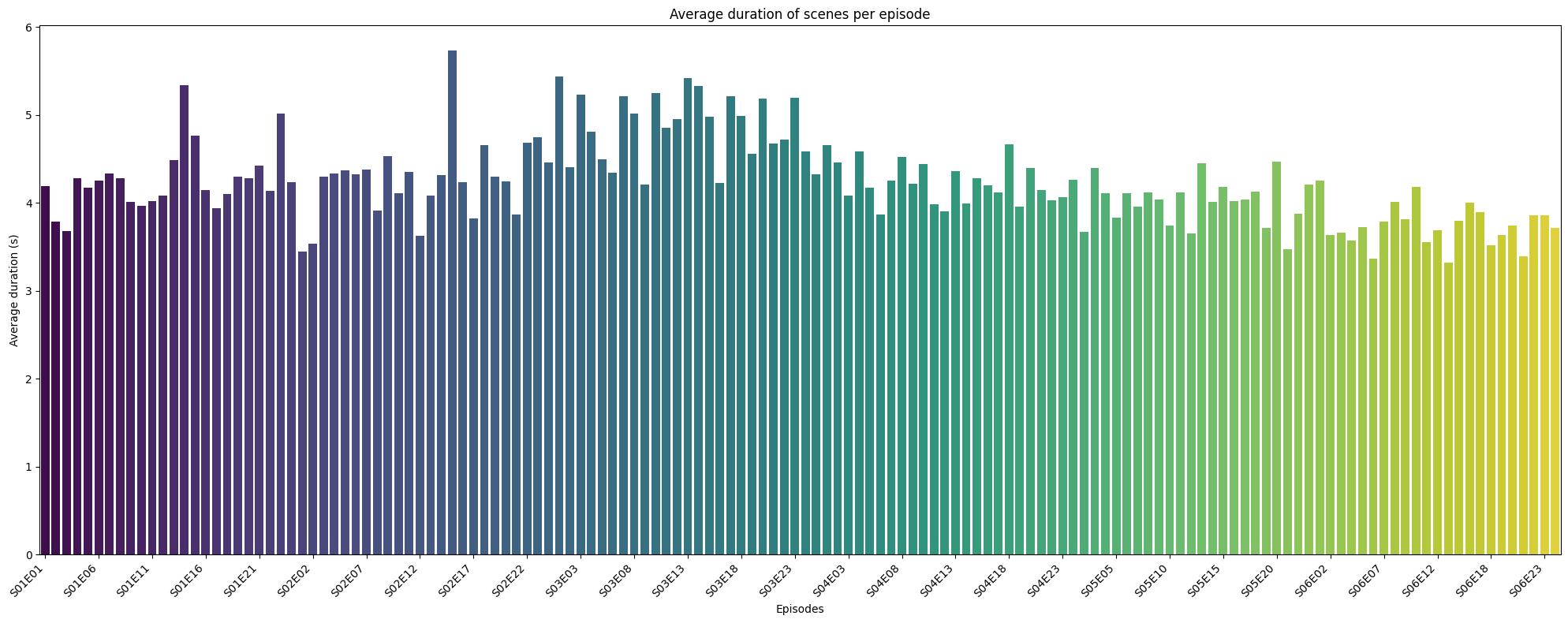
AVERAGE DURATION 🕰️ OF SEGMENTS PER EPISODES
Here we see that some episodes have longer scene durations, since the episodes all have about the same runtime, the number of scenes should be ajusted in a way to the lenght of the segments and vice versa.
Source
plt.figure(figsize=(20, 8))
ax = sns.barplot(data=mean_duration, x="episode_short", y="duration", palette="viridis")
ax.set_xticks(ax.get_xticks()[::5])  # show every 5th label
ax.set_xticklabels(ax.get_xticklabels(), rotation=45, ha="right")
plt.title("Average duration of scenes per episode")
plt.ylabel("Average duration (s)")
plt.xlabel("Episodes")
plt.tight_layout()
plt.show()
/tmp/ipykernel_6421/3446811800.py:2: FutureWarning:

Passing `palette` without assigning `hue` is deprecated and will be removed in v0.14.0. Assign the `x` variable to `hue` and set `legend=False` for the same effect.

  ax = sns.barplot(data=mean_duration, x="episode_short", y="duration", palette="viridis")
Source
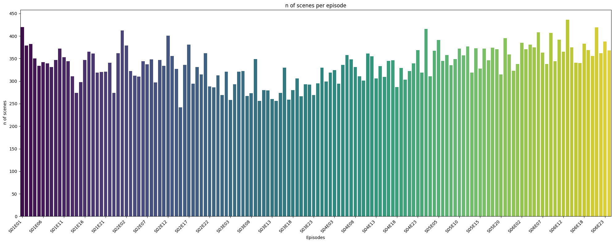
scene_count = df.groupby("episode_short")["scene_number"].count().reset_index(name="num_scenes")NUMBER OF SCENES 🧩 IN EPISODES
This graph and the previous one suggest that the number of scenes and the average scene length are inversely related, likely due to the constraint of a fixed total episode duration. Rather than a linear dependency, their relationship appears nonlinear and hyperbolic (i.e.,
).
A regression analysis—especially one using a nonlinear or inverse model—could provide a deeper understanding of how scene structuring varies across episodes. While a linear model may offer a rough approximation within a limited range, nonlinear regression would more accurately reflect the underlying relationship.
Further analysis could test whether this pattern holds consistently across seasons or varies with episode pacing and narrative structure.
Source
plt.figure(figsize=(20, 8))
ax = sns.barplot(data=scene_count, x="episode_short", y="num_scenes", palette="viridis")
ax.set_xticks(ax.get_xticks()[::5])  # show every 5th label
ax.set_xticklabels(ax.get_xticklabels(), rotation=45, ha="right")
ax.set_yticks(range(0, 500, 50))
plt.title("n of scenes per episode")
plt.ylabel(" n of scenes")
plt.xlabel("Episodes")
plt.tight_layout()
plt.show()
/tmp/ipykernel_6421/441019428.py:2: FutureWarning:
Passing `palette` without assigning `hue` is deprecated and will be removed in v0.14.0. Assign the `x` variable to `hue` and set `legend=False` for the same effect.
ax = sns.barplot(data=scene_count, x="episode_short", y="num_scenes", palette="viridis")
SCENES DURATIONS 🕰️
Here we have the length of all the scenes! Feel free to explore
Source
import pandas as pd
import plotly.graph_objects as go

# Sort seasons
seasons = sorted(df['season'].unique())

# Create figure
fig = go.Figure()
all_traces = []

# Track how many episodes per season (for visibility masks)
season_trace_counts = []

# Create violin traces for each season's episodes
for season in seasons:
    filtered_df = df[df['season'] == season]
    episodes = sorted(filtered_df['episode_short'].unique())
    trace_count = 0

    for ep in episodes:
        ep_df = filtered_df[filtered_df['episode_short'] == ep]

        trace = go.Violin(
            x=[ep] * len(ep_df),
            y=ep_df['duration'],
            name=f"Ep {ep}",
            box_visible=True,
            meanline_visible=True,
            points="all",
            visible=(season == seasons[0]),  # Only show first season initially
            customdata=ep_df[['global_scene_number', 'duration']].values,
            hovertemplate=(
                "Episode: %{x}<br>" +
                "Global scene: %{customdata[0]}<br>" +
                "Duration: %{customdata[1]} seconds<br>" +
                "<extra></extra>"  # hides the trace name in the tooltip
    )
)
        fig.add_trace(trace)
        trace_count += 1

    season_trace_counts.append(trace_count)

# Compute visibility masks for each season
# Compute visibility masks for each season
visibility_masks = []
total_traces = sum(season_trace_counts)
start = 0
for count in season_trace_counts:
    mask = [False] * total_traces
    for i in range(count):
        mask[start + i] = True
    visibility_masks.append(mask)
    start += count


# Create dropdown buttons
dropdown_buttons = [
    dict(
        label=f"Season {season}",
        method="update",
        args=[
            {"visible": visibility_masks[i]},
            {"title": f"Scene Duration – Season {season}"}
        ]
    )
    for i, season in enumerate(seasons)
]

# Update layout
fig.update_layout(
    updatemenus=[
        dict(
            active=0,
            buttons=dropdown_buttons,
            x=0.1,
            y=1.15,
            xanchor="left",
            yanchor="top"
        )
    ],
    title=f"Scene Duration – Season {seasons[0]}",
    xaxis_title="Episode",
    yaxis_title="Duration (seconds)",
    width=1200,
    height=600,
    showlegend=False
)

fig.show()
Source
import pandas as pd
import plotly.graph_objects as go

# Sort seasons
seasons = sorted(df['season'].unique())

# Create figure
fig = go.Figure()
season_trace_count = []

# Add one scatter trace per season
for i, season in enumerate(seasons):
    filtered_df = df[df['season'] == season]

    trace = go.Scatter(
        x=filtered_df['global_scene_number'],
        y=filtered_df['duration'],
        mode='markers',
        name=f"Season {season}",
        customdata=filtered_df[['episode_short', 'scene_number']],
        hovertemplate=(
            "Global Scene: %{x}<br>" +
            "Duration: %{y} seconds<br>" +
            "Episode: %{customdata[0]}<br>" +
            "Scene: %{customdata[1]}<br>" +
            "<extra></extra>"
        ),
        visible=(i == 0)  # Only show first season initially
    )
    fig.add_trace(trace)

# Create visibility masks for dropdown
visibility_masks = [
    [i == j for i in range(len(seasons))]
    for j in range(len(seasons))
]

# Create dropdown buttons
dropdown_buttons = [
    dict(
        label=f"Season {season}",
        method="update",
        args=[
            {"visible": visibility_masks[i]},
            {"title": f"Scene Duration – Season {season}"}
        ]
    )
    for i, season in enumerate(seasons)
]

# Update layout
fig.update_layout(
    updatemenus=[
        dict(
            active=0,
            buttons=dropdown_buttons,
            x=0.1,
            y=1.2,
            xanchor="left",
            yanchor="top"
        )
    ],
    title=f"Scene Duration – Season {seasons[0]}",
    xaxis_title="Global Scene Number",
    yaxis_title="Duration (seconds)",
    width=1200,
    height=600
)

fig.show()